Mastering Machine Learning based Land Use Classification with Python: A Comprehensive Guide!
In this blog, we will explore the world of machine learning based land use classification using Python. We will take a deep dive into advanced techniques and algorithms for accurate land use classification. Whether you are a beginner or an experienced data scientist, this comprehensive guide will equip you with the tools and knowledge needed to master land use classification and transform the way you analyze and manage land resources. Follow along as we uncover the power of machine learning for land use classification with Python.

Land use land cover (LULC) classification involves categorizing different landscapes based on their unique characteristics, such as vegetation, soil type, topography, and land cover. Check out my recent papers if you are interested in the theoretical details of Machine Learning (ML) applications in LULC classification.
While there are many platforms for land-use classification (ArcGIS Pro, QGIS, etc.), they all lack the power to tweak and customize the workflow (For instance, you don’t have many models available there for classification). Furthermore, there are other Python libraries (i.e., GDAL) for this purpose, but their efficiency is questionable on larger datasets.
So for this blog, I will focus on the use of open-sourced Python modules (Rasterio, Numpy, and Scikit-learn) for LULC classification using multiple machine learning (ML) models.
The ML-based land use classification process typically involves the following 4 steps:

1. Data acquisition and preprocessing:
The first step in land use classification is to acquire the data. This can be done using satellite images, aerial photographs, or ground surveys. Once the data is acquired, it needs to be preprocessed to remove any noise or artifacts that may interfere with the classification process. This can involve removing clouds or other atmospheric effects and correcting for differences in illumination. For this tutorial, I used an example image of Sentinel-2 over Tokyo, Japan, with bands [Blue, Green, Red, and NIR], with minimal cloud cover. Feel free to use other data sources available.
Satellite Image: You can download any satellite image from USGS or GEE.
Labels (samples): You can collect either from a field survey or manually through an image overlay. For manual creation, use any GIS software, create a shapefile (Point), and add points with their respective label as attributes.
I uploaded the input image and labels to this blog GitHub repo (link at the end). Feel free to use them yourself!

Once you have finalized downloading the satellite image and collected labels (samples), we can proceed to the coding workflow.
2. Feature extraction:
First, we will import the required Python libraries, provide input locations for our image and labels, and a list of input image band names.
import rasterio as rio
from rasterio.plot import show
import geopandas as gpd
import fiona
import matplotlib.pyplot as plt
import seaborn as sns
import numpy as np
import pandas as pd
import sklearn
from sklearn.metrics import classification_report, accuracy_score


# variables
# Note: labels should be always last column with name "labels"
# Note: Make sure input labels shapefile and input raster have same CRS, otherwise code will not run

# input files
raster_loc = 'materials/rasters/s2image.tif'
points_loc = 'materials/shapefiles/samples.shp'
temp_point_loc = 'materials/temp/temp_y_points.shp'

# land cover names (for post visualization)
lulc_name = ['Water', 'Dense Veg', 'Veg', 'Impervious']
Optional step: You can visualize the available satellite image bands along with Natural color and false color composites (codes are given in the Jupyter Notebook) using the matplotlib subplots. The resulting bands will look like this:

Next, read the input satellite image as rasterio array, and label shapefile as geopandas dataframe. For feature extraction, first assigna unique ID number and save it as a new temporary file.
#  reading bands from input
with rio.open(raster_loc) as img:
    bands = (img.read()).shape[0]
print('Bands of input image: ', bands)

# using ilteration to automatically create a bands list

features = []
for i in range(bands):
    features.append('band'+str(i+1))
print('Bands names: ', features)
f_len = len(features)

points = gpd.read_file(points_loc)
# adding a new column 'id' with range of points
points = points.assign(id=range(len(points)))
# saving nenw point file with 'id'
points.to_file(temp_point_loc)
# converting gdf to pd df and removing geometry
points_df = pd.DataFrame(points.drop(columns='geometry'))
Next, create an empty pandas series dataframe, and iterate each label using Fiona with python for loop. For each iteration, the respective value of each band (and other features such as NDVI) is saved for each label location. After iteration, reshape the data to a list format.
# ilterating over multiband raster
sampled = pd.Series()

#inputShape= temp_point_loc
# Read input shapefile with fiona and iterate over each feature
with fiona.open(temp_point_loc) as shp:
    for feature in shp:
        siteID = feature['properties']['id']
        coords = feature['geometry']['coordinates']
        # Read pixel value at the given coordinates using Rasterio
        # NB: `sample()` returns an iterable of ndarrays.
        with rio.open(raster_loc) as stack_src:
                  value = [v for v in stack_src.sample([coords])]
        # Update the pandas serie accordingly
        sampled.loc[siteID] = value

# reshaping sampled values
df1 = pd.DataFrame(sampled.values.tolist(), index=sampled.index)
df1['id'] = df1.index
df1 = pd.DataFrame(df1[0].values.tolist(),
                   columns=features)
df1['id'] = df1.index

data = pd.merge(df1, points_df, on ='id')
print('Sampled Data: \n',data)
Once features are sampled, separate the data into X (independent variable — features) and Y (dependent variable — labels). After that, use Scikit-learn train_test_split function to divide the data into a 70/30 ratio (70% for training and 30% for testing).
x = data.iloc[:,0:f_len]
X = x.values
y = data.iloc[:,-1]
Y = y.values

from sklearn.model_selection import train_test_split

X_train, X_test, y_train, y_test = train_test_split(X, Y, test_size=0.30, stratify = Y)

print(f'X_train Shape: {X_train.shape}\nX_test Shape: {X_test.shape}\ny_train Shape: {y_train.shape}\ny_test Shape:{y_test.shape}')
3. Model Training and Accuracy Assessment
Once the train and test data is prepared, it's very simple to run models with default parameters (Hyparametric optimization topic may be covered in another blog).
SVM
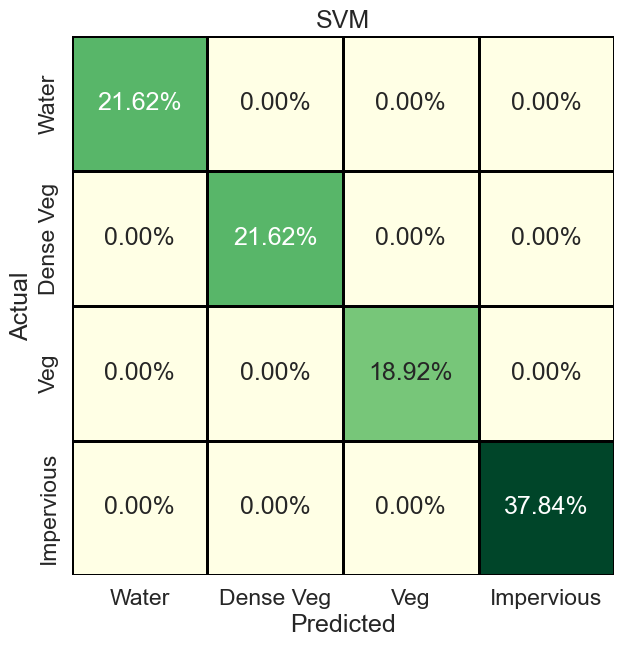
First, we will start with the Support Vector Machine (SVM) model. First import the model (such as from Scikit-learn). Then define its parameters (in the case of SVM, we input kernel as “rbf”). Once the model is initialized, use ‘‘fit’’ function to train the model with train x and y data. After that, use x test data to check sample prediction and use Scikit-learn accuracy_score to check the model accuracy for that particular sample prediction. In our case, SVM correctly classified all pixels, so an accuracy of 100%.
from sklearn.svm import SVC
from sklearn.metrics import confusion_matrix
cName = 'SVM'
clf = SVC(kernel='rbf')
clf.fit(X_train, y_train)

clf_pred = clf.predict(X_test)

print(f"Accuracy {cName}: {accuracy_score(y_test, clf_pred)*100}")
print(classification_report(y_test, clf_pred))
To further check the performance of the model, we can evaluate the confusion matrix and visualize it using the Seaborn ‘‘sns.heatmap’’ function.
# Confusion Matrix
cm = confusion_matrix(y_test, clf_pred)
print('Confusion Matrix RF: \n',cm)
cm_percent = cm/np.sum(cm)

plt.figure(figsize=(7, 7), facecolor='w', edgecolor='k')
sns.set(font_scale=1.5)

sns.heatmap(cm_percent,
            xticklabels=lulc_name,
            yticklabels=lulc_name,
            cmap="YlGn",
            annot=True,
            fmt='.2%',
            cbar=False,
            linewidths=2,
            linecolor='black')

plt.title(cName)
plt.xlabel('Predicted')
plt.ylabel('Actual')
#plt.savefig(f'../figs/confusion_matrix_{cName}.png', dpi=300, bbox_inches='tight')
The resulting confusion matrix looks like this. For further changes, see this blog.
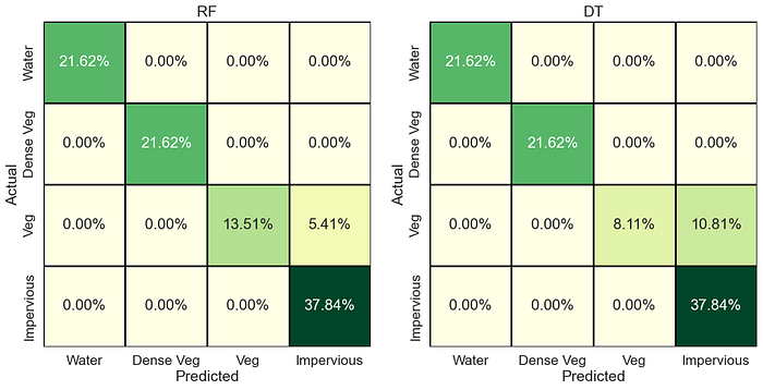
We can now perform the same steps for different models. For the list of available classification models in Scikit-learn see this list. You can also use other models (outside of Scikit-learn), such as XGBoost and LightGBM. For further testing, we run Random Forest (RF) and Decision Trees (DT) models, the confusion matrix of which are below (codes available in the main Jupyter Notebook).
RF gets an accuracy of 94%, whereas DT gets 89% accuracy. So in our case, SVM and RF both performed well. Also, note that the maximum confusion is observed between vegetation and impervious class of LULC.
There are more ways to evaluate classification model performance, such as ROC/AUC curve, Model variable importance, precision-recall, f1-scores, etc. I will cover those may be in my future blogs.
4. Predicting and Exporting Data
The most crucial step is to predict full data using our trained model and export numerically predicted results in native Geotiff format. Though many options are available (GDAL or using GeoPandas/Geocube), they are far less efficient in scaling this process to larger geographical regions (I am currently doing analysis on a national scale, and those techniques are bottlenecks). So a better way using rasterio is given as follows.
First, read the original input image, and get different metadata properties (height, width, CRS). After that, reshape the image in the same way you provided the input data for training. Note that if you added extra features such as NDVI or Elevation earlier, you may need to first composite them with the input image and then do this process. Use the code below for that:
%%time
cName = 'SVM'
exp_name = f'materials/results/lulc_{cName}.tif'


img = rio.open(raster_loc)
img_arr = img.read()
bands = img_arr.shape[0]
print(f'Height: {img_arr.shape[1]}\nWidth: {img_arr.shape[2]}\nBands: {img_arr.shape[0]}\n')
img_n = np.moveaxis(img_arr, 0, -1)
img_n = img_n.reshape(-1, f_len)
print('reshaped full data shape  for prediction: ',img_n.shape)
metadata = img.met
height = metadata.get('height')
width = metadata.get('width')
crs = metadata.get('crs')
transform = metadata.get('transform')
Then use the existing model, with predict command to predict the full data you just reshaped. Depending on your input data, this is the process that will take most of the time (and your RAM and CPU speed utilization). Once predicted, reshape it again to input (original image height, width) shape.
pred_full = clf.predict(img_n)

print('Prediction Done, now exporting raster \n')

img_reshape = pred_full.reshape(height, width)
Lastly, use rasterio export raster command to export the predicted/reshaped results.
out_raster = rio.open(exp_name,
                                         'w',
                                          driver='GTiff',
                                          height=height,
                                          width=width,
                                          count=1, # output band number
                                          dtype='uint8', #output data type
                                          crs=crs,
                                          transform = transform,
                                          nodata = 255 #nodata
                                          )

out_raster.write(img_reshape, 1)
out_raster.close()
Once exported, you can open it either using Python or in Geographic Information System (GIS) software (ArcGIS Pro or QGIS). The output will look like this (of course, after you set colors, names and map key, etc)
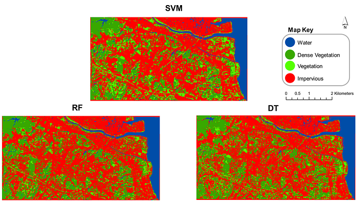
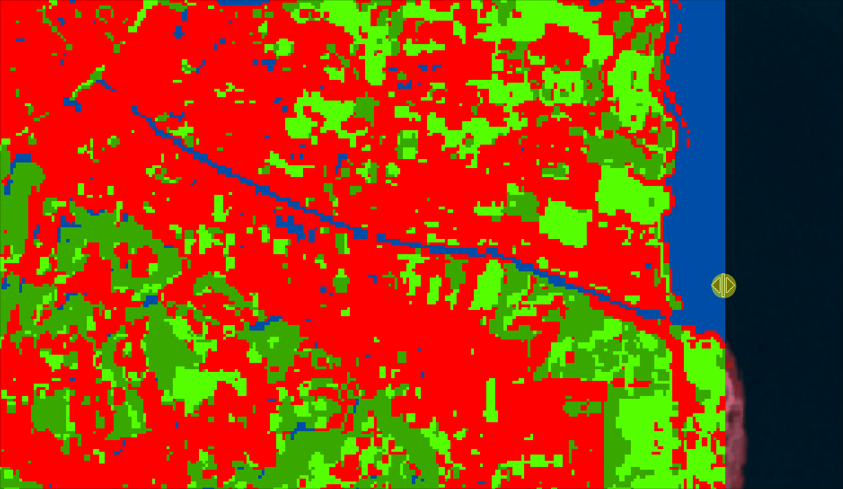
You can also overlay your LULC over your input image and see if the classes correspond to the correct labels/locations.
Conclusion:
In this blog, we explored how to classify ML-based LULC using Python. The process involves data acquisition and preprocessing, feature extraction, training the classification model, and classification of new data. Python has several libraries that can be used for each of these steps, making it a powerful tool for land use classification. With the right tools and techniques, land use classification can help us better understand and manage our natural resources. The codes associated with this blog are freely available on my GitHub (https://github.com/waleedgeo/lulc_py).
If this blog was helpful, feel free to share it and follow me for more such content. Furthermore, you can use my published studies for ML-based LULC reference.
My LinkedIn: https://www.linkedin.com/in/waleedgeo/
My Portfolio Webpage: www.waleedgeo.com
— — — — — — — — — — — — — — — — — — — — — — — — — — — — — — — — — — — — —
Acknowledgment
This blog would not be possible without the open-sourced contributions of:
People:
Dr. Sajjad Muhammad (my Ph.D. Supervisor, which provided me with this idea to work on)
Prof. Qiusheng Wu (Countless contributions to open-source Geospatial data science community). Check his Geemap and Leafmap packages.
Bonny P (author of Python for Geospatial Data Analysis)
Blogs:
Books:
Applied Predictive Modeling by Max Kuhn
A Student’s Guide to Python for Physical Modeling by Jesse M. Kinder